Other Ways to Use Digital Kits & Photoshop - PART 1

This is the first of a 3-part series on other ways to use kits and Photoshop. I will be showing different projects I've done using my skills, that might give you a few ideas!

When I first started out with digital, I did what everyone does. I found any freebie kit I could get and downloaded it. But after awhile, I learned to not use freebies so much.
1. Freebies are often low quality
2. Freebies are overdownloaded--everyone will have pages with the same kits!
3. Freebies are often small and incomplete, with few papers and elements.
4. Freebies are often NOT WORTH the storage space.

Have I deleted all these worthless freebies? No. I don't have the guts. Plus, there have been times when I've found them to be useful after all. In fact, I've found SO MANY uses for my kits in other areas of my life, its unbelievable. I thought I'd blog about it and show you some of the projects I've done over the years with my kits and my Photoshop skills. SO useful.

First of all, I'm a teacher. I use my Photoshop skills in my classroom all the time. I also use them for my church projects A LOT.  I served in the Primary for some years and am now serving there again. The Primary is the church classes for the younger kids in my church. (I'm LDS.) So I've used my skills a lot for handouts and displays and stuff. And, of course, I've used them for personal projects like baby showers and stuff. I have SO MANY projects to share, I'm dividing this post into three! Today's post will show only SCHOOL projects that I've done in the past. The next post will be church projects, and the third will be Personal.

POSTERS

READ Posters

A few years back our middle school was really focusing on literacy. So I used my mad Photoshop skills to create READ posters. This was actually quite simple. I took a picture of the teacher, and then added the writing. A lot of times I used Actions to change up the lettering on READ. I made about 40 of these over the years.

Here's a little tip though--how did I get the word "READ" behind the teacher's head? I used my polygoal lasso to outline the top of her head. Then I just copied and pasted. This created a new layer of just to top of her head. Then I placed the layer on top of my READ layer. That simple.


Literacy Poster

I love this one. Our school also had a Literacy Night where Brandon Mull, author of Fablehaven, came to speak. It was actually a pretty awesome night. I made the posters for it. I think that when the posters are well done, people will assume the activity will be as well.

This one could never have been done without a LIBERAL use of ACTIONS. First, the title is using atomiccupcake's gold action. one of my persona favorites. The torn paper is actually a picture of the map of Middle Earth that I got off of Google Images. I used my polygon lasso to cut a few holes in it. Then I ran atomiccupcakes burned edges action to get that burnt look.

Then there are the staps. Those are so awesome. I created those with regular shapes and text. Then I ran another action. I can't remember which! I think it was atomiccupcake's Rough Lithograph. I'll have to check on that one.

Ballroom Poster

At my school I ran a ballroom program for a few years. So I created this and many other posters to advertise for it. I used funny sayings about dance to attract the attention of my target audience--junior high BOYS of course. And it worked! In the three years I did ballroom at my school, I taught over 100 boys how to dance! And that many girls, too! Advertising totally works!

All this required was a stroke border (I draw a shape, add a separate layer stroke, and delete the original shape) Then I silhoetted the picture, added the text, and done! Very quick and easy.

Musical Poster

Our school does a school musical every year. This was a poster I made for a prop. I took the photo, silohetted the picture, and added the text. I used an ACTION on the text--it was atomiccupcake's sparkle action. For the border, I used atomiccupcake's gem action. I demonstrated that one in lesson 10.

Programs

I also did the program for the school musical. I'm not going to post a lot of it here, though, since it says the names of my students. But here's the picture section that went in the center section of the 8 page program.
Thank You Cards

For a project at school, I needed the help of other teachers. So to thank them, I made these thank you cards. So I made some that looked like this, using my kits. Now, I had the advantage of a really nice color laser printer, but I'm sure it would work on any decent printer. I printed it on one side, turned it over, and printed it on the other. Then cut it out. I took a few tries to get it lined up just right. I ended up making a front and back template, so that it would print properly and all lined up.

DVD's
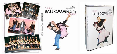
I am very good about getting all my home videos transferred to DVD as soon as possible. I know if I leave them on tapes or even stored digitally on my computer for long, I'll forget about it. I use Photoshop to create my menus for my DVD's. I use a program called Pinacle to create my DVD's and stuff. For my ballroom team, I used Photoshop to create the DVD covers and everything.  And, of course, for the covers I silhoetted the picture first. I talk about this in lesson 13.
For my personal DVD's, I use kits all the time. I create a background like this:

Then I just add the menu on top of it. I then create a CD cover for it with the same kit, and print it on CD labels. I know, I'm a total nerd. But oh well.


And one last one for my teaching stuff:

In my Keyboarding classes the kids earn cars that they put up on the wall when they get a speed of 25 wpm or more on a 3-minute timing. I even used my digital kits to make them these cute cars. I have a whole bunch of different ones--they get to pick their car. They like that. :)


Ok! Next post, part 2, will be all church related projects!


ABC Book - Using Blurb

UPDATE (7/13): I have created another ABC Book! If you'd like to see my newest one, click here! It also includes a free template to make your own!

So I'm afraid my current yearbook has been sadly neglected this month. But I'm only two months behind so it can't be that bad, right? I've been working on a different project.

I usually get a wild hair to do a new project in the shower or in a dream. I'm not kidding. I'm that weird. One time I had an inspiration for a new project for my 7th graders in the shower--it resulted in scratching another project I'd been doing for 5 years and starting all over--I'm STILL working on that project getting it fine-tuned. When I get an idea in my head, I know it's time to act!

So, I decided to make and ABC book for my little girl. Not super original I know--I made one a few years ago for my mom that was a sort of "brag book" she could carry around. That one was very small, I printed it myelf, and had it bound with a spiral binder. It was also when I was a total beginner in Photoshop.

I headed into this project like I do so many others--I work on all the "fun" parts before I actually figure out the mechanics of how I'm going to actually do it. I decided to make each letter a two-page spread, and have each page a 5x7 or 4x6, and then I'd print them like photos at Wal-Mart, and insert them in a plastic pocket album. Then we could take it to church and keep Afton entertained by pointing at it and saying, "See? C! C is for your Aunt Cindy!"


I went straight to work, creating cute little 5x7 pages like this:

It was really fun. I got pretty addicted. I finished almost the entire book. Well, except those annoying letters like X and V. No idea what I'm doing for X.

Anyway, I'm going merrily on my way, and then I think, "oh! I should find an album for this!"

Yeah. Good luck. I was stunned that I couldn't find anywhere on the internet what I wanted. Just a cheap 5x7 or 4x6 plastic album. They had them, but not with the 52 pages I needed! Of COURSE none of them were 52 pages!

And suddenly I realize--Where am I gonna print this thing?

I tried my faithful Cherishbound. But I found the cost was too high for such a simple book. I didn't want to spend a lot on this--it's just a little easy book for church. Not my yearbook that needs to look really nice and professional.

And then I remember. BLURB. Blurb.com. A friend of mine told me about Blurb before. I checked it out, and was shocked at how low the prices are. I downloaded the editor that is free off their website. It's very, very easy to use and I like it a lot! I just needed to adjust my pages from a 5x7 to an 8x8, since that's the closest size Blurb does.

And I came across another stumbling block. This one I did not expect. THERE WAS SO MUCH SPACE!! I haven't scrapped a 12x12 page in years. I've NEVER scrapped a 12x12 digitally. I switched to 8 1/2 x11 right off the bat. And as I tried to "adjust" my pages, I came to a sudden understanding:

All those impractical pages I've whined about--the ones with ONE picture and lots of froo-froo elements? They can do that--because they have ROOM!! Man, what a difference a few more inches makes! I have no intention of switching to 12x12, and I STILL think one picture per page is impractical. But I can see why they leave so much space--they can.  I find myself VERY uncomfortable with blank spaces. I must commend those scrappers out there who can leave a whole side of paper totally blank. How do they do this? I do not have that kind of control!

So anyway, I uploaded my book last night. It cost me $25.00 with shipping. I thought of waiting to post about this until after the book arrived, so I could tell you all if the quality is good. But...I can't wait. I'll add an update later. It was so exciting to submit my book! And one thing I LOVE about Blurb is that you can have other people preview your book!

Here are a few pages from the book, in case you just don't want to go look at it. But if you'd like to see the book, click here: Afton's ABC Book on Blurb.


As for instructions on making this book, it was really quite simple. The techniques I used are ALL explained in this blog.

  1. I started with an 8x8 page. 
  2. Drew a square shape. Then CTRL+Clicked on it's layer. Created a new layer by clickingn on the new layer icon (or Layer>New>Layer)
  3. Went to Edit, Stroke, and choose a black stroke, about 40 pixles, inside.
  4. Deleted the original square and kept just the stroke, which was now my border. Whenever I started a new page, I picked a new kit and chose a paper from that kit. Then I did the whole copy and paste thing that I describe in Lesson 16 and Lesson 14. I just drag the border on the paper I want, CTRL+Click on the border, then highlight the paper I want and copy then paste. TheN i drag the new colored border back to my original page.
  5. Used this as my template--I pulled in a large letter B and typed "Is for..." and saved it as my template. Whenever I started a new letter, I made sure the new letter was roughly the same size as the one on my template.
  6. Came up with words for each letter. I just did a bulleted list in Word. I searched the internet for ideas by typing "ABC Book." This was useful in coming up with words for X and V and stuff. 
  7. Found pictures that fit with each letter. I used the same stroke on each picture that wasn't silhoetted, just changed the color. I'd just right click on the layer and copy the layer style, then paste it on another picture.
  8. Made sure to be consistant with my font--chose the same font and font size for each thing I typed.
  9. For the letters, I used letters from kits I already had on file. I only made a few of the letters myself, like the E and the I. But most came from kits so they were already done. The Atomic Cupcake kits have some really great alphas.
  10. I found pictures from the last 18 months of my baby that could be silhoetted. This was the most work--silhoetting a picture can be time consuming if you want to do it right. (You can read how in Lesson 13.)
  11. After completing each page, I uploaded it to blurb.com, after I had downloaded theer free editor.
  12. Uploaded it to blurb and paid! That simple! Gosh, I hope it turns out cute.
I sat in church with my little girl today and she was looking at her books. She LOVES to turn pages and look at books. I can't wait to show her this one and point out all her relatives--she's getting to that age where she's learning their names and occasionally says them. Yay! Ok. I'm done now.

*** UPDATE***

10/5/10

Got my book from Blurb today! IT IS GORGEOUS! Exactly what I hoped for! The quality isn't as good as Cherishbound, but only if you really look for it. I'll continue to do my major books at Cherishbound, of course, but Blurb is so awesome for any other projects! I love my book! And so does Afton!

RealCrappy - DIE, Di-cuts!!

It's hard to say which element of paper scrapping I miss the least, but I think di-cuts are in my top three. I think most paper scrappers have figured this out, because it's pretty much gone the way of the dinosaur. I don't know--am I wrong? Do paper scrappers use them anymore? There MUST be such a thing a cute page using di-cuts. There MUST be a reason we used them. They were good for lettering I suppose, though you were so limited in your fonts.

This is the very first page I ever scrapbooked. Though the pictures are from as early as 1993, I think I actually scrapped it in 1995 or so.


Now, believe it or not, I have pages that are much worse later on. I remember when I first did it, I was quite proud of it. Now I'm a bit horrified. I need to do a whole 'nother post on cutting pictures into stupid shapes. But the di-cuts in this are just plain stupid. Why the fire-cracker, WHY? I guess I can understand the multi-colored dancers, but what is with the 70's hearts? This thing is just full of di-cuts.

Oh I remember it well. Going to a scrap store--but only after I had called in advance and reserved a time with the di-cut machine. Apparently in 1995 there were actually LINES of people waiting to destroy their memories with tacky di-cuts. I was no exception. I'd go and make a whole ton of di-cuts of various things, with no real plan of what they would be for and just a vague hope that one day you'd use it. Which I guess would explain why there were so many erroneous di-cuts on my pages later on--I was just trying to get rid of stuff. I have a massive fear of wasting stuff--I'm even worse now that I'm older. I often sacrificed art for the sake of not wasting a 10 cent di-cut.

Ok. This was my FIRST page. Of course I sucked. IS it possible to do a cute page with di-cuts? I'm gonna go search my stash and see what I can find...

*

*

*

...I found one! This has a lot of di-cuts, and it's still kinda cute! This is from much later--I probably scrapped this in about 2002. I have a HUGE book from my 18 months in Africa as a missionary. And I must say I don't cringe on most the pages--they are still pretty cute. Paper scrapping got SO much better in the 2000's. That's a whole 'nother post too!

Ok, here it is:


I think with this one, more sophisticated di-cuts were now available, and I'd learned the chalking technique, which made di-cuts look a little less flat and boring. So I guess di-cuts aren't that bad--just the ones from the 90's!

Well, perhaps it isn't fair of me to pit against each other layouts that are seven years apart--I had gotten much better, and so had the scrapbooking industry. And that's one thing about it--scrapbooking is always improving. We are always finding way to fine-tune it and make it better. To me, doing it digital is one of those ways!

Lesson 19: Saving Your Files

I find that I have neglected giving a full explanation of how to save your files, and what file types you should be using. This will be a short lesson, and some of it may seem very elementary to you. But I wanted to cover my bases on this one. Sometimes I assume people understand something, but it's just a piece that's missing in their knowledge base.

First of all, you need to understand different file types. When you save a file in a certain program, that program has it's DEFAULT setting--what it will automatically save it as if you don't change it. For instance, if you save a file in Microsoft Word, it will be saved as a .doc file. (or .docx if you have Office 2007.) If you save an Excel file, it's a .xls file. In Photoshop, it will save as a .psd file. Usually, these files can ONLY be opened in the program that you created it in. You can't open a .psd Photoshop in Word, for example.

This fact is very important when digital scrapbooking. When you choose to save, you can pull down a menu where you can change what type of file you are saving it as.

PSD - In Photoshop, as long as the file is a .psd file, you can go back and change it. Your layers will stay there. When you open the file, you can see all your layers and you can delete and add to your heart's content. BUT--.psd files are HUGE. They take up a lot of space. Plus, if you are uploading it to a website for printing, they don't accept .psd files.

JPG - A JPEG is another file type. You can see it on the pull down menu shown above. When you save your file as a JPEG, you are basically flattening the image. When you open it again in Photoshop, you will not be able to see your layers. It's now one flat picture and you can't make changes. It's also a smaller file. You want to save your files as JPG's so you can upload them.

DON'T DELETE YOUR PSD FILES!!! When I finish creating a page, I save it as a .psd file. Then I save it AGAIN, usually in another folder, as a .jpg. I keep both copies. Often I'll upload my .jpg for printing, and then notice a spelling error or maybe my margins are too narrow and my text is going to fall off the page. I might need to go back to my original .psd file, make some changes, then resave as a .psd and a .jpg and reload. That's why I don't delete my .psd's.

After I print a book and I'm sure its fine and there's no going back--only THEN do I delete my .psd files. But I keep my .jpgs forever. You never know when you might need it.

PNG - This is another file type you might want to become familiar with. You'll notice that when you download a kit, the files are all .png's and not the other two. The reason for this is TRANSPARENCY. JPG's don't support transparency, and PNG's do. Whenever you see a checkerboard background like this, that means the background is transparent. When you pull the flower into your document, you won't get a white background with it. So, if you ever create your own elements (like I created this one), make sure to save it as a .png file. If you save it as a .jpg, you will get an ugly white background that you have to delete out.

PDF - Another cool thing about Photoshop is the ability to save your files as a .PDF. You are probably famliar with this format. PDF files can be opened by pretty much anyone, so long as they have Adobe--which is standard for most computers. Its a good way to give out a file that you want to be unchangeable, and can be opened by anyone. So, for example, when I create a freebie template--like the box freebies I have here on my blog, I save it as a .pdf. Then even if you don't have Photoshop, you can still open it and print it. But you don't have access to the individual elements of the kit that I used. I've also used it when I created the program for our school play. Knowing that Kinko's would open the file with Photoshop, I knew that the fonts I had used they probably wouldn't have. So I flatten the image and then save them all as .pdf's. This way there's no way the fonts or anything else can be messed up when opened on another computer by someone else. One year I didn't do that, and the program didn't turn out right at all! I was so upset!

ZIP & RAR - The last types of file I want to point out is ZIP files and RAR files. I would hope by now you've figured out what ZIPS are--it's pretty necessary for digital scrapbooking! Because the files in a kit are so large, when you buy a new kit, it's usually in zip form. You have to UNZIP the file. You do this by downloading a free coy of Winzip. You might also come across a program called Winrar. I can't really tell you the difference--it does pretty much the same thing. I have both winzip and winrar on my computer. .RAR files are also zipped, and also have a free program download.I find I prefer winrar because it doesn't ask you do register as often. (Both programs are shareware--you can only download them for a while before they will start asking for a registration code. I just download it again.)
When you want to unzip a .zip or .rar file, just right click on the file. Then click on Extract to Here. It will then extract the whole contents of the .zip file into the current folder. It's that easy. You can even highlight several zipped files and unzip them all at the same time.

As a side note, I keep all my zip files. I usuall create another folder within the kit that is called "zips." I do this so that if I need to transfer the kit to another comptuer (I use my kits on three different computers--home, work, and laptop) I can easily just transfer the small zip files and then unzip them again.


Making Paper Boxes Using Photoshop

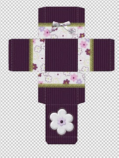
So I've been working on this project, and I thought it might be fun to share it on my blog! Making paper boxes is something I LOVE to do using Photoshop. I've made these boxes for lots of reasons--everything from handouts at church to birthday party invitations. I also have a tutorial for Pentagon Boxes, Making Envelopes, Heartboxes/Favors, Triangle Favors, and Box with Separate Lid.

Here's a pile of the ones I've been working on:

WARNING: If you have not done my early tutorials, you will likely not be ready for this one. This one builds on a lot of what we've already learned. Remember--milk before meat! You can't do projects like this one until you've learned the basics! So if you haven't--go spend some time on the early tutorials, and then come back!

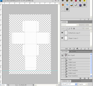
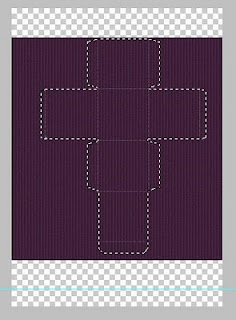
Now, there are A LOT of patterns for paper boxes out there. Most of them are made to print, but I like to take them into Photoshop and make them a little easier to work with digitally. In this post I will attach the Photoshop file I used to create the box in the tutorial, and I'll have a download of the completed box. Although I got the original box pattern online (so long ago I don't remember where) it's been altered quite a bit from it's original form to make it easier to use Photoshop.

**NOTE** (January 2018) I have just updated the box pattern download so that is comes from my Teachers Pay Teachers site. It is still free!)


DOWNLOAD BOX PATTERN & SAMPLE BOXES HERE

You can also watch a tutorial how to design it in Photoshop here. It is for a different box type, but he concepts are the same.
Step One: Ok. First of all, download the paper box with attached lid above. You'll notice there are TWO layers. The shape of the box, and the lines which tell you where to fold. This was one of my biggest changes--I wanted the two layers separate, so that the box pattern can be covered up, but the dotted lines stay on top of every other layer, so you can still see them when you cut the pattern out. 
Now, if you haven't read my cut and paste tutorial, you'll want to do that before you do this one--I use those techniques A LOT in this.

Next, you need to choose the kit you would like to use for your box. It doesn't need to be large--in fact, I often use the mini kit freebies I've downloaded for this sort of thing.
 
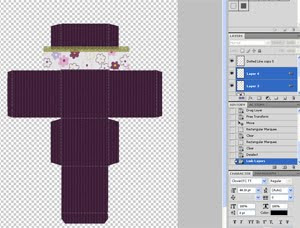
Step Two: Now that you have your kit, choose the paper you'd like to be the main background of your box, and pull it in to your document. You want the layer of this paper to be BETWEEN the dotted lines layer and the pattern layer.

Click on the pattern layer. Then hold down the CTRL key and click on the picture section of the layer. You should now see "dancing ants" around the pattern.

Now click on the paper layer. You should still see the dancing ants, even though you are highlighting a different layer in the layer toolbox. Do CTRL+C to copy. Then do CTRL+V to paste.

Now you have a new layer, which is the same shape as your pattern but in the paper you wanted. Delete the paper you orginally pulled in. Make sure the dotted lines layer is still on top.
Step Three: Now, you are ready to "decorate" the page with whatever elements you choose. It's important that you pay attention to what each square is and what direction it will go once you've folded and put together the box. It  can be a real challenge to get the paper to line up correctly, since the four sides all go in three different directions.

For this tutorial, I decided to create a box with another color on the bottom and a ribbon. So, I pulled up another page, then used my marquee tool to select a rectangle roughly the size that I need. Then I clicked on the arrow tool and dragged it into my document.

Then I dragged in a ribbon and made it roughly the size I wanted using CTRL+T. I linked them together and then pressed CTRL+E to make them one layer. This will make it easier for me to paste it on the other three sides, and make sure that they all line up.

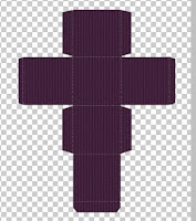
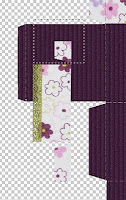
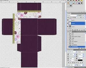
 Now you'll do that same cut and paste trick that we did earlier. Click on page background color layer (purple for me) and do CTRL+Click. Then click on your new ribbon layer, and copy and paste. DO NOT DELETE THE ORIGINAL. Just move it out of the way. Place your new layer you just pasted where you want it.
Now, get the old layer and do CTRL+T. Hovering your cursor on the corner, you'll see it turn into a bent arrow. This will allow you to turn the layer another direction by clicking and turning it. And repeat the same steps again. You may have to use your marquee tool to delete any excess that comes up when you copy and paste.
Do these same steps for all four sides. Then, just decorate the rest of the box how you want, keeping in mind what it will loook like once it's folded.


Step Four: Once you've got it how you want it, you are ready to print! I print this in a laser printer, but it will work fine on an ink jet. I also do it on white cardstock. You can print on regular paper, it just won't be very strong.

Step Five: After you have it printed, cut it out very carefully with sharp scissors. It's pretty important that you follow the outlines as exactly as you can--but I'm sure you know that.

Step Six: Now, you are ready to fold. The dotted lines should be visible--I hope you kept them as the TOP layer on your photoshop file! Make sure you fold right where the line is, and fold it evenly. This is a huge factor in whether your box will turn out "rickety" or not. Some of my boxes turn out better than others based on how I fold and tape it.


Step Seven: After folding it, it should be pretty obvious where it all connects. I just use scotch tape to tape the sides together.
And voila! you are done! I think it looks pretty darn cute.


RealCrappy - Obnoxious Silhoetting

This is something I'm afraid I am TERRIBLY guilty of. I mean, BAD. I went through my old books, and it was so easy to find pages where I had gone completely nuts silhoetting stuff--with absolutely no notion of what pictures SHOULD be silhoetted and which shouldn't. Plus, I'm afraid I was very guilty back then of shaving off a few pounds when I cut pictures out me. And it is SO FREAKING OBVIOUS. I'm kind of annoyed, now. I'd like to see what I REALLY looked like back then. Silhoetted pictures can make it very hard to see that.
This page struck me as particularly annoying. I silhoetted nearly every picture in it! And the ones I didn't, I cut into these really irregular wierd shapes. Why did I find that necessary? I remember when I made this page I was quite proud of it. Now it's just kinda sad.

Silhoetting pictures can be really awesome if you do it right. This one took me forever:

But I thought it turned out really cool. The beauty with digital is, of course, fixing mistakes and the ability to change your mind. You can always go back and take the silhoette out. Sometimes, after you do it you think, "eh. Not so much." In paper scrap--you're stuck. Oh digital. How I love you...

Something new--11x17 Pages

So, last night I tried something new when creating a page. I'm actually kind of surprised it never occured to me before, and maybe some of you will read this and think, "well duh! I do that all the time!" but I think I'm going to do this a lot.

Ok, usually, when I create a layout, I create a new page in 8 1/2 x 11. I do a background of some kind before adding any pictures. A lot of times I will save that page as "name of page"1 and then I'll make some changes, and save it again as "name of page"2. Then I open up page 1 again. So basically, I have two copies of the same page. This way, things like ribbons and paper strips will match up when I put them into one layout.

Why is it that I've been doing it this way for YEARS and it's never occured to me to combine them into one page? It's so much easier!

I created a new page in a size 11x17. (or a 12x24 if you do that size) Then I used a guide to tell me where center is. (To get a guide, go to View, Ruler. Then click on the ruler (pictured below) and drag. You will get an aqua colored line that you can place anywhere. It's just a guide--it won't be part of your page. You can use as many as you need. You can see mine in the middle of this page.)

On my 11x17, I create a FULL layout--one that would cover two pages.Then I finished the page by adding all the rest of the pictures and elements that I wanted.

 How exciting it was to place that flower right in the middle, and know that it won't get all crooked, trying to get the two pages to match up.I rarely do pages like that because they are such a pain.

Next, I saved it as a .psd file so I could go back and make changes if I wanted to. Then, I flattened the image. This means that you are "merging" all the layers into one layer. To flatten, you go to Layer>Flatten Image.

Next, I'm ready to crop. So I got my crop tool, and in the crop options bar, I typed in 8 1/2 x 11. Then I just cropped the first half of the page. I saved it as a .jpg--more specifically, I saved it as thepark1.jpg.


Then I cropped the other half and named it the park2.jpg.

Eager to see it uploaded in my Cherishbound book, I did just that:
UPDATE:
Here's what this page looks like, printed in my book. I've used this technique for over a year now and it's become the ONLY way I do it!


I'm so glad the edges line up great. I might have to go back and do the same thing to this page:

The ribbon edges don't quite match up, and it bugs me. This way, I can make SURE they match up. I remember when I made this page last year:
How I AGONIZED over trying to get that one shot that goes across the middle to line up just right. Duh. I made it so much harder for myself. Although--when you print in a bound book, you have to account for margins, so it still might not match up perfectly. But it will look a lot closer, at least.

Anyway, there's soemthing new I wanted to share with you all!

Lesson 18: Organzing Your Digital Scrapbook

One thing that can really overwhelm beginners in digital scrapbooking is how to organize. Organizing can be a huge challenge! First, you need to organize your life into books, second, you need to organize each individual book. And third--you need to organize your photos into each year or book you are doing, so you can find them quick and easy when you need them.
Organizing Your Life

It can be very difficult, particularly if you are very far behind, to know where to begin with scrapbooking. Do you start with this year? Or do you go back to the very beginning? I create all my books by the year--do you have to go back to 1972 and work your way forward?

The first thing I would suggest is to compartmentalize your life. All of us have lives that are divided by large events. Your childhood. Your teen years. College. Marriage before children. Raising a family. Find those deciding events, and create a book for each of them. Each book can cover several years, instead of just one.

For me, I started paper scrapping in the 90's. My teen years are done. My childhood pictures are still in an album--and likely to stay that way. I have little interest in digital scrapbooking those photos.  When I started doing digital, I was in the middle of a paper scrapping book. I finished that book up, and begin my digital journey with a huge event--my courtship with my husband. Since then, I've done a book for each year of our marriage.

But what if you are in your tenth year of marriage and haven't scrapped any of it--do you do a book for each of the ten years? Well, I suppose you could. But I suggest you compartmentalize your life and make a book for each compartment. The first five years without kids, maybe a baby book for each of your kids, and then from here on out--a year book for each year.

How you do it is up to you, but I suggest you plan this out. And WRITE IT DOWN. Save it in a file somewhere. You'll be glad you did.

Organizing Your Book

And now, to organize an individual book. Choose where to start. My suggestion is to start with this year or last year--something recent. But it's up to you. Whenever I start a new book, I have to take quite a bit of time to think out how I'm going to put it together. Here are some things you may want to ask yourself:

What time period am I going to cover?
Is my book going to be chronological?
Am I scrapping by the month, or by big events?
Am I going to use kits?
Am I going to use the same kit through the whole book, or a different kit for each page?
Am I making all backgrounds the same, or different?
Am I writing the journaling in first person or third?

Once I've answered these questions, I usually use Excel to help me map out my book. Now--you certainly don't have to use Excel--I happen to be very proficient in it so that's what I use. But I like to create something visual to help me see what I'm going to do. It looks something like this:
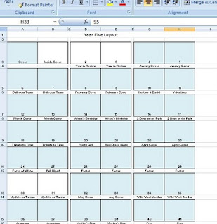
As I finish a page, I color it so I know it's been done. Again--this is just how I do it. The point is, it's a good idea to plan beforehand and write it down. I also upload my book page by page to Cherishbound as I finish it, so I can see it all laid out. Or, if you are printing individual pages, you can place them in the order that you've already planned--not necessarily in the order you printed them or finished them. I want my book to have a cohesive feel to it--not just a bunch of pages thrown together. That's why I love a published book--it just feels like--well, a BOOK. With a beginning, a middle and an end. It has a title, a story, and a conclusion. I always do a conclusion on the last page where I talk about the year and what I've learned.

Now, it's a little easier to start. You don't have to start with page one. You can pick and choose which page to do first--whatever you feel comfortable with. You don't have to go in order. As you can see from my Excel sheet, there are a few pages that aren't done. This is because although they will be placed in the middle of the book, they will use pictures from the whole year. One is about my baby and her cousin who are only 18 hours apart. I am doing a page about the two of them, with pictures I've taken throughout the whole year. So I just leave it blank, and when I'm ready I'll scrap it.

If you are super busy and don't have a lot of time to scrap, you might want to instead take a few minutes each night to do your jounaling only. Just open up a Word document and jot a few things down. Escpecially if what you are scrapping is time-sensitive, like documenting your child's first year. Then, when you have the time to scrap, the writing is all done and you can copy and paste it.

Here are a few examples of how to organize certain types of books. They are just suggestions--do it the way YOU want to do it!

Baby Books

My sister's book for her son didn't so much focus on the chronological, but she based it around milestones. Like a page about "eating" and then photos from all 18 months as Preston learned to eat. And then another page on "walking" or "rolling" or whatever. It was difficult to revisit 18 months on one topic, but it's fun to see, too! She went chronological with her other two children's 18 month books.
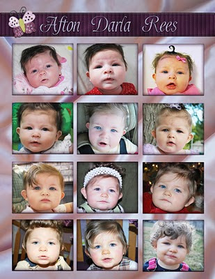
When I did Afton's book, I decided to go chronological, but not by the month of the year, rather how many months old she was. I started with a page where I took a picture of Afton each month and showed how she changed. I LOVE that page.

Next, I did a "birth" section where my husband and I both wrote the story of her birth. Then, each month, I took a really great photo of her on the aniversary of her birthday. I made that a full bleed page at the beginning of each month. It got a little hard to figure it out sometimes--Afton was born on the 15th, so each month strattled two months and so the picture for "10 months" was actually a picture of her at the END of 10 months--anyway, it did get a little confusing. Still, I love this book!

I created a background for each month and used it on every page of that month. So really, I only had to come up with 12 backgrounds. Made it a little quicker to make the book.

As a sidenote, I also created the kit for her book myself. Now, don't get me wrong here--I am NOT a kit designer. But for Afton's book, I just photographed her recieving blankets and her coverlet and created my own elements. (The butterfly on the picture above is actually from her coverlet--took a picture of it and silhoetted it.) I also used a lot of stuff from atomiccupcake, where she has, say, a ribbon or a bow that you can recolor with your own papers. Here's a link to one of them.


Yearbooks
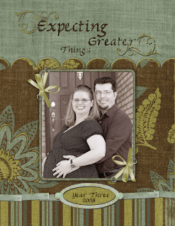
This is a concept utterly alien to me before I started digital scrapbooking. Before that, I just scrapped whatever event I had pictures for an put them in a book. But I LOVE having yearbooks. Basically, I have a book for each year, and scrapbook everything in that year. I usually title it with a subtitle. Like, "Year Three - Expecting Greater Things" when I was pregnant, or "Year Two - Getting Better All the Time."

My timing worked out great--I started Digital scrapbooking just when I met my husband, so I have one for each year of our marriage. My layout is pretty similar--a cover, then an "events" layout where I basically list or show the big events of the year. I go in chronological order, and use different kits for each event. If an event takes five or six layouts to cover, I use the same kit. Like my Disneyland section in 2008--there were 10 pages for that, and I just used the same kit for all ten pages.
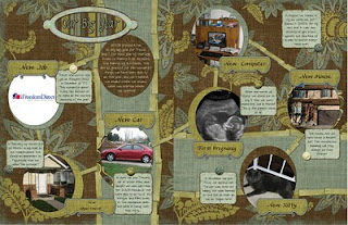
For this year's yearbook, I'm doing a month coverpage for each month. On that double layout, I put pictures from that month that I want to include in my yearbook, but don't necessarily want to do an entire layout about. I have SO MANY pictures of my baby, it works great to do it that way.
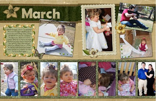
My yearbooks can get pretty long--last year's book was almost 100 pages! But with Cherishbound it cost me less than $150 to print it, which is about what it would cost to print it page by page plus an album anyway.


My sister has three kids and is really busy. For her HUGE yearbook this last year, not only did she use the same kit for the whole book--she used the same background. All she had to do was create one background, then pull it up for each new page and re-save it as another name. She just dropped the pictures in where she needed them. The book looks great--very neat and organized. And she was able to finish it much more quickly. If you have a lot of catchup to do on your scrapbooking, or if you are just REALLY busy, I suggest you try this method. It's faster and the pages still look awesome and different. Though I admit--I think it works better to do this in a bound book then on individually printed pages.

Wedding Book
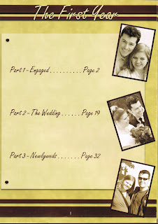
For my first year of marriage book, I actually put it into sections. Its the only book where I have a "Table of Contents." The first page shows three sections: Part 1: Engaged, Part 2: The Wedding, and Part 3: Newlyweds. Then, when you go to the assigned page I have a "cover page" for that section, with the title and a full-bleed photo to go with it.

Organizing it this way made it much more cohesive, since that particular year was so clearly divided into these three categories!

For the wedding section, I focused not on just telling the story, but on each aspect of the wedding. I have a page for the cake, for the flowers, the photography, the proposal, ect.


Organize Your Photos


You will find it much easier to scrapbook if your photos are organized and easy to find. I'm a very organized person in SOME areas of my life, and photos happen to be one of them. I'm amazed how many people I know have their photos randomly uploaded wherever and have to look forever to find them.

It is worth your time to organize. Trust me.

My suggestion is, create a file folder for each year. Within that year, your photos should be saved by either event or date. That simple. I have a 2010 folder. In it there are subfolders labeled "August 2010" and all the other months. I've set up my uploading program so that when a photo uploads, it is saved by date. Then I just drag that folder, once uploaded, into the proper month. It's that easy.

Now, if you are going back in time doing a LOT of photos, or if you have a ton of scanned ones, I'd save by year (or a group of years if you are going very far back and aren't sure) or you can save by the book you plan to put it in. Then create subfolders with events. Any pictures that don't fall under an event, save in a miscellaneous file.

This may take a little time, but it will save you buckets of time in the future. If you don't, you'll find that as you start to scrap a page, you end up spending hours finding the right photos, and then nothing gets done!

Also, when you ARE ready to create a page, you have to narrow down which pictures you will use. I usually go through the folder and pull into Photoshop all the pictures I want. Then I narrow it down as I do my page.

Conclusion

Of course there is no RIGHT WAY to organize your life OR your book. These are just a few suggestions. Do what is right for you. There are some aspects of my books that are always the same, and there are unique things I do each year that work for my needs. But my biggest advice of all--write it down. Look over your pictures, see what you have, and plan your pages.