So I've been asked why I have not only never done a lesson on clipping masks, but pretty much never mentioned them. Well, the old adage is, "write what you know." And I have hardly ever used them. Not being a big fan of templates, I've just never had the need to. In fact, I didn't even know what they were until a few months ago. Just a hole in my knowledge I guess, but I never noticed or cared. However, I am perfectly aware that, like many features in Photoshop, if I start using them I will probably start wondering what took me so long. And I am also aware that many of my readers probably DO use templates and would appreciate a lesson! So, I'm learning too. If you read this and have any suggestions for a better/faster way, please add them to the comments!
**Update** I have created a few templates free to download in this post. Feel free to check them out!
**Update** I have created a step by step video on how to use a template--you can see it by clicking on the image below.
What is a Template?
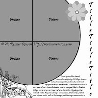
Lets begin with defining the term Template. Skip past this if you already know. A template is a "dummy" page that is a blank layout--you can fill in the elements with the kit and photos of your choice. But you don't have to come up with the layout yourself. Here's an example of one I found on Google Images, from No Reimer Reason.
Why don't I use them? I don't know. It's kinda like cheating I guess. I like feeling like I came up with it on my own. Plus most templates are made for 12x12 and so I'd have to adjust it anyway. And I have a very distinct style and most of them just don't seem to use enough pictures for me. I don't know. I've used them a few times, and I never seem to like the pages much. But again--that's just me. Some people absolutely love them and there's nothing wrong with that!
Well, some of you may have read my recent entry about the site
Sketches by Suzy. I don't know if it's because she used the word "sketches" instead of "template" or if she explained in her home page that they are really just "a jumping off point" but suddenly, I'm thinking this template thing is kind of cool. I did a page using one and LOVED how it turned out. Suddenly I felt a little more liberated to change it to suit my needs (like 8 1/2 x 11) and make it my own. I've done two layouts now using her sketches and I love them both.
So, for the first one I did, I just looked at the template and make mine look like that. But for my second layout, I decided to try the old clipping mask. Ironically, the last time I tried the clipping mask was on last year's February page, and this was THIS YEAR's February page. So that tells you how much I use it! Anyway, here's the sketch I used, and here's how it ultimately turned out. As you can see, I ended up making quite a few changes, mainly because I had to adjust for an 8 1/2 x 11 page.
What is a clipping mask?
I have a feeling there's a whole world of stuff masks can do that I have not yet discovered. I really hesitated writing this entry because I don't feel I'm the most qualified to teach it, as I'm such a beginner in this technique.
But I'll try to explain it as if you are paper scrapping. Imagine you have a piece of paper that you cut out a circle shape in the middle. Underneath it, you place a photo, so that the photo is showing through the circle cut out. You can move that picture as much as you want until its exaclty where you want it to be. So yeah--clipping masks are like that--only digital.
Am I totally massacring this?
Lets do a really basic mask.
1. Start with a blank page in Photoshop of your prefered size.
2. Pull in a photo.
3. Go to your shapes icon and draw a shape--preferably a custom shape. Color doesn't matter.
4. Rasterize your shape--it's easier to deal with rasterized. If you forgot how, just right click on the shape layer and choose Rasterize.
4. Now move your picture layer so that it is covering up your shape--move it on top of the
shape layer.
5. With the picture layer selected in the layer panel, do Alt+Ctrl+G or Layer, Create Clipping Mask.
6. Your picture has now been cut to the size of your shape.
7. Note that you still have two layers. If you use your arrow tool on the picture you can move it to exactly where you want it.
My problem with this technique was always that I couldn't move it after that. If you click and drag on either layer, you just move around the picture or the mask. You can't move the whole thing at once. So you can either merge it, as explained below, or you can click on each layer (holding down the CTRL key) and link them by clicking on the chainlink icon at the bottom of the layer menu. Now they will both move together and you are still able to change them. Once you merge them, you can't change them again. I still merge them though, because I'm usually pretty certain it's how I want it, and it's just cleaner and easier for me.
8. Hold down the CTRL key and click on both layers in the layer panel. Press CTRL+E, or Layer, Merge Down. Now your picture is set in that shape. You can't change it anymore, but you can move it, add borders, do an action on it, or whatever.
So now, to apply this to a template. The template you download will be full of layers--layers for each element on the page. You simply pull in your pictures and papers, etc, and clip them right in.
Using a Template
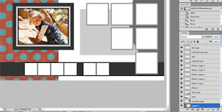
Ok, now for another tutorial where we apply the above technique to an actual template. I downloaded what is, right now, Suzy's most recent sketch. Here's what it looks like when unzipped. (I've adjusted the size of the photo so it's not much use to you--if you want the actual sketch as I got it as it's free, click
here.)
You will also see that in your layers panel, every element of the layout is it's own layer. So now I'm going to start filling in the spots with pictures.
The first layer I want to replace is the large picture on the first page. This layer is called 7x5 in the layer panel on the right.
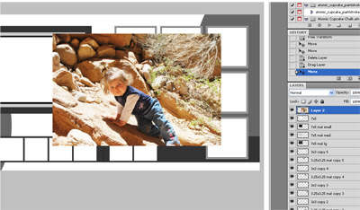
So now I will pull in my picture and place it so it's layer is ON TOP of the layer called 7x5. Now I just do ALT+CTRL+G.
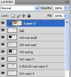
Note note that now my picture layer, Layer 2, has a little arrow next to it. If I want to merge it with the layer I clipped it to, I would hold down the CTRL key and highlight Layer 2 and 7x5, and then press CTRL+E. This basically cements it into place and makes it moveable. I don't have to do this step at all, or I can wait until I'm sure.
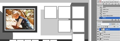
Now the picture is clipped in right to the right size. And, I can still transpose it to make it smaller or larger (CTRL+T) and I can move it around so I'm sure it's exaclty where I want it.
Now let's do the same technique again, this time with a paper. I'll pull in some paper I want to use for the half circle on the left and for the background. This is from a free kit from Peppermint Creative called Kindergarten Crafts.
Make sure, once again, that you have found which layer in the template is the one you want to clip. In this case, its called Lg Circle, toward the bottom. I pull in my picture, and immediately drag it down the layer panel until it is just above the Lg Circle layer.
Do ALT+CTRL+G, and it will clip it right into place.
Here's my page after I've done this technique in several places. Note how my layers looks--they all have the little arrows. I haven't yet merged any of them together. (Yes, I know this page isn't that cute--I've long since scrapped these pictures. This will not be a real page for me!)
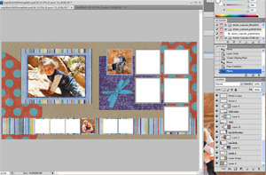
I've also inserted that blue ribbon--not part of the actual template, but I use the elements I have in the kit I've chosen to decorate the page as I want. That's something to remember about templates--you can change it how you want!
Now maybe that is enough for you. You can clip everything in and you're pretty much done, except adding titles, journaling, and elements as you see fit. For me, I'm just not done. It's hard for me to leave those edges alone. If you look up at my February page, you see that each paper element and each picture is edged in ink. I think it makes the page look more "done." If you want to add a shadow, a bevel, or anything else from the Layer Styles menu, make sure you have the clipped layer highlighted and not your picture when you do it. It will work just fine. But, if you want to use an action like I do, you will have to merge the layers together you can.
Here's my page now that I've merged a few layers and added a chalk border using an action from Atomic Cupcake. Looks a lot better if you ask me.
So there it is. My tutorial on clipping masks. After doing it, I think I might start to do them more often!


 But now I'm expecting twins, and I'm stumped again. This time I wanted to do the room in red, lime green, and white. Strange colors, needless to say. As one of my twins will be named "Scarlett," I had to use red! But so few colors look good with red, and so I chose a lime green for my other twin, Ripley. I found this bedding online, and absolutely loved it. Love it. And there are NO KITS that look remotely like it that I could find.


