FONT, FONT, FONT
- Is it a TITLE font, or a JOURNALING font? Some fonts are too obnoxious to do all your writing in. I wish so much that my 7th graders realized this when they do their power points! They turn in whole pages written in this obnoxious font in garish colors that are hard to read! But I'm sure none of you would do that! Anyway, when you download a font, keep in mind which of these categories it belongs in.
- Will I use it? There are SO many fonts out there, and you can't download them all. Before you choose to download a font, ask yourself this question honestly--can you picture a situation in which this font would be perfect?
- Is it blocky or thin? "Blocky" fonts are AWESOME in digital scrapbooking because you can use actions on them and mess with them a little bit more than thin fonts. So don't leave the blocky ones out--there is so much you can do with them!
- How do I install it? There are plenty of websites that tell you how to do this. But here's the short version for a PC--most fonts are in a .zip file when you download them. So unzip them, and it will now be in a .ttf file. Then just move it into your Fonts file, which is on your hard drive, Windows, Fonts. That's it. If the file is NOT zipped but is already a .ttf file, just move it into the fonts folder.
Using Layer Styles
This is the quickest and easiest way to change your title font. I use it a lot--but definitely not every time. If I did, all my titles would look too similar. Still, there are some fun options in here that can help. These were all discussed in Lesson 6: Layer Styles. Add a shadow, a bevel, a gradient, etc. Putting different styles together can give you different looks.
Note that in order to have a gradient AND a pattern overlay at the same time, you have to change the blending mode to "multiply" on the gradient. So, when you click on the Gradient box, click on the actual WORDS gradient, and then you'll see a pull down menu on the right that says "Blending Mode." Pull that down, and change it to Multiply.
In this example, I did a very simple title in white--I just added a bevel and a shadow. That's it! I think it turned out quite nice--but I wouldn't want to do ALL my titles this way, even though it is the quickest way to enhance a title.
Copy & Paste with Paper
By now if you've been reading a lot of this blog, you've learned that I use my "cut and paste" trick a lot. Well, titles are no different. Use your paper for your title. Pull in the paper you want. Type in your title in the desired font. Then CTRL+Click on your font layer (on the large T section). Then click on the paper layer. Do copy and paste. You now have your words "punched" out of the paper on a new layer. I usually add a shadow, stroke, action, or something to make it pop a little bit more. I use this technique all the time--it's very simple and very effective.
Try Different Sizes & Fonts
Another way to change up your title is to mess with different sizes. A lot of times, my title will be three separate layers, each with a different size or style on it. For this one on the right, I had two layers. I used papers to do the "Helping" and "The Bear" (my Dad's nickname) was just a regular font. It can make your page so much more interesting if you vary the font and sizes. I must admit, though, that I don't do this all that often. I've seen some amazing examples on other blogs, but I'm afraid I am not the best at this!
Use Kit Alphas
This is kind of an obvious one, but I have to include it. A lot of kits come with their own alpha. Unfortunately, a lot of designers no longer include the alpha, or they charge extra for it as an "add-on." As I've gotten better at using ations and creating in Photoshop, I look at the alphas carefully before purchasing. A lof of them are quite simple, and I could make them myself. Still, it can make a quick and cute title to use the alphas that come with the kit. Atomic Cupcake has some of the best Alphas. When creating my ABC Book, I only created the letters myself on a few of the letters. Most of them are Alphas from kits, and most of them are from Atomic Cupcake.
Find the Perfect Font
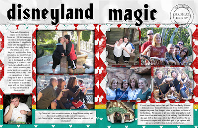
 A lot of font website have "copy" fonts from movies, etc. Obviously they won't have everything, but a lot of times you can find some great fonts that way. When I went to Disneyland, I was surprised at how little there was out there in the way of kits for scrapbooking it--though really, with how tight-fisted Disney is with copyright, it shouldn't be a surprise. I did a lot of Google searches on Disney fonts and found several really cute ones. This particular font is called "started by a mouse."
 Here's another example. My husband and I went to Tucson one year so we could see the symphony there perform the music for The Lord of the Rings. (My husband is a die-hard fan. Has all the swords and everything.) I made this page without a kit. I found a map of Tucson, and one of Middle Earth. I then found a font online called "aniron" which is an AWESOME Lord of the Rings font. There's another one called "Ringbearer" that's the exact movie font, but I liked this one better. Anyway, I thought it added a really nice touch to choose that font from the movie.
Use Media from Events
 If you go to an event, make sure you pick up any maps, programs, etc, that you can. This can be AWESOME for when you scrapbook it. Yes, I know this is NOT an original idea--but keep it in mind when you go somewhere! Here's how I've used it:
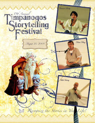
This was from the Timpanogos Storytelling Festival a few years ago. The title, I actually did myself, using an AWESOME action from Atomic Cupcake called Rough Lithograph. It looks a lot like the original title. But the artwork--isn't that gorgeous! When I saw that from the program, I knew I had to use it. So that artwork and all the swirlies and even the writing at the bottom, "Recognize the Stories in you Life!" is straight from the program. Basically, I scanned in the whole cover of the program, used the Clone tool to get rid of
any writing I didn't want. Then I added my title and everything else. So, the whole yellow background is actually straight from the program cover, though the ribbon along the top and bottom and the blue ribbon down the side came from a GORGEOUS kit by Krista called Sundance.
Also with media, use logos. You can find a lot of logos online. For this page, I wanted to title it "this Old House" when writing about a 100-year-old house that we visit as a family. It was an easy thing to find a logo from the TV show, and then just use my cut &paste trick to "punch" the logo out of the paper that I wanted.
Use an Action -- Or Lots of Actions!
Ok, back to my Action obesession. Serioulsy, I don't think there's scarcely a page I do that I don't use an action! I love them! I have so many examples of this, I don't know where to start!
For this page, I used two actions from Atomic Cupcake--the Epoxy action and the small silver action. I've explained this process on how to do borders, but I also do it on text. I first typed in my text, then I did CTRL+Click on the typing and created a new layer. Then I went to Edit, Stroke. I created a small stroke--probably about size 8 or so. Now I have two layers--one with the text, and one with the border of the text. I just ran an epoxy action on the words, and the small silver action on the border. Then I place them on top of each other, highlight both layers, and did CTRL+E to combine them into one layer.

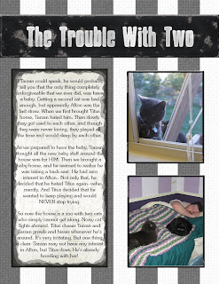
This next example, I used another action called Stencil. I'm pretty sure I had never really used this action until I did this page--I'd had it for a long time, but never needed it. I thought it turned out PERFECT for this page! I wanted it to have a "jail" theme, since my two naughty cats were always getting into trouble. So first, I create a black box, and then did the "Old Painted Metal" action on it from Atomic Cupcake. Another of my favorites that I use A LOT. Then I just added the stencil action to my white text. I love how it made it look like it had been spray painted on! I also used a "heavy ink" action for the journaling square, and then I used the "Old Painted Metal" action on the borders for each picture. Yes, I think it's clear I'm obsessed with Atomic Cupcake's actions!
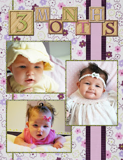
 This last example--yes, it IS an action. A really cute one from Atomic called "Wooden toy". I used it a lot in my daughter's first year book--I thought it was just perfect for a little kid's book! Now, if you've read my tutorial on Actions, you'll know this is a specific kind of action where you create a black and white image, then run the action. Everyting in white becomes wood, and everything in black becomes the color you selected in your color picker before running the action. I created a whole alpha set just for her book, and used it on the cover and in several places throughout the book.
 These are just three out of about a million examples. Like I said--this is the option I use the most.
Use Your Pictures!
You can find some pretty creative ways to incorporate your pictures into your pages. And it's a great way to squeeze in more photos! You know me. It's all about squeezing in more photos. I must admit, though, that this is largely unexplored for me--I need to find more ways of doing this!
This example to the left was a little out of character for me. I planned it, though, right there at the par, which is why Trevor and I took our picture in front of the "R" at Disney California. I like the idea, but I admit, I never did quite love the way it turned out. Still, I like the idea that I used a picture in my title.
The other day I ran across this AMAZING page by Stefanie at Stefstyle. It blew me away. I really, really need to make a page like this one! And let me just do a plug by the way--I'm totally in awe of Stefanie's stuff--I can't even begin to compete with it! She doesn't use any kits--just pure brilliance. I love it!


No comments:
Post a Comment