
First, here's a page I just completed on the zoo.

Textures
A texture is just that--it's like a regular paper from a kit, only it's gray and textured and boring to look at. You can add the texture to anything from lettering to other papers, but I usually add it to a shape. In the page above, I added it to the dark yellow/brown background. Here's how I did it:

2. Pull in the texture as you would a regular paper or picture. Make sure it's layer is ON TOP of your shape layer.
3. On the layer panel, double click on the TEXTURE layer. This will open the layer style menu. On the blending options menu, pull it down and choose Hard Light. Or you can choose Soft Light, depending on your preference.
4. Now your texture is sort of see-through, and you can see the color of your shape through it. But they are still seperate layers. I usually merge the layers together to make it one paper.
Actions & Borders
I'm grouping these two together because I feel that I have already covered them rather extensively in previous lessons: Lesson 10: Using Actions, and Lesson 14: Picture Borders. Actions are pretty essential for making your own elements. In fact, many times I will purchase a kit and can totally tell that some of the elements were made using Atomic Cupcake actions that I already own. I used actions in the above page to create the torn paper look. Torn paper is the first action I ever purchased, and I've used it enough times to buy it ten times over. There will be more about actions and how I used them throughout the rest of this post.
As for borders, I used this technique quite a bit on my zoo page. First I created a separate layer border by using the technique described in the lesson 14 tutorial--ctrl+clicking the layer, adding a new layer, doing Edit, Stroke, and then copying and pasting the layer onto the paper I want. This gives me a separate layer border made from the paper of my choosing. (If this is confusing to you, you'll need to follow the Lesson 14 tutorial, which explains in more detail and has a free video.) Then I just did the same process again to add the yellow border lines--on both the picture borders and the ribbons. I once again did CTRL+Click on the border I just made, added a layer, did edit, stroke, and made a thin stroke in that yellow color. After that I just added the default bevel and shadow and done!
I love creating my own borders because I can customize them to the exact size I need, rather than relying on a pre-set size in a pre-made kit.
Here's another page I did recently with only limited use of kits--I LOVE this page!

For this one I made my own papers. I scanned in the material we used to create the bedding for my baby nursery. That was easy enough. I used the corderoy texture from Atomic Cupcake to create the red and green vertical ribons. The polka dot ribbon is also from a scan of the material we used, and the bow is using an awesome template from Atomic Cupcake. This brings me to another way of making Elements:
Element Templates
Again, another shameful plug for Atomic Cupcake. I don't know if other sites have created things like this, but I absolutely love the ones from this site and have used them multiple times. There are templates for bows, knots, ricrac, flowers, etc. You can find their selection here. Using them is simple.

2. Pull in the paper you would like to use.
3. Place the paper where indicated in the layers, and the template automatically changes to that paper.
4. Just do CTRL+E and now it's all one layer and ready to drag into your page.
So this is how I created the bow in my sewing page. So easy and so cute!
I also used a lot of actions in it--I used the Fabric action from Atomic Cupcake to create the white background. I used the Stitching action to create the stitched border around the bottom three pictures--that another action I highly reccommend if you can afford to only buy a few.
I used the Frayed Fabric action to create the edging on the bottom pictures. I actually just used the rectangular marquee tool to draw a box smaller than the actual picture, then did Select, Inverse to select the OUTSIDE of the box. Then I copied and pasted, creating a new border made from my actual picture. Then I ran the action on that border. I know, sounds complicated. But it wasn't a big deal!
Recoloring
Of course, another simple method is to recolor elements from other kits to match your scheme. I did this on the sewing page as well--the kit I used was from Two Peas in a Bucket, called Sew Glad We're Friends by Chrissy W Digital. But her kit used purples and pinks, and I needed reds and greens. So I just recolored the pins and the measuring tape to what I wanted. There are several methods to recoloring, which I think I've mentioned on this blog before:
Image>Adjustment>Color Balance

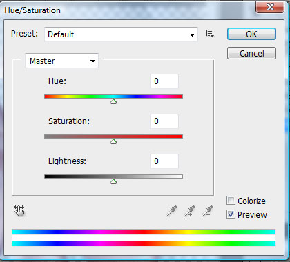
Image>Adjustment>Hue/Saturation
Image>Adjustment>Match Color
This one is also quite useful. I'm not going to give a full explantion of it here, as I have a quick-tip that will take you through it step by step. You can find it here: Match Color. But basically, you pull up one element or paper you want to change, and match it to another paper that is the color you want. Very useful, and I use it all the time!
Well, here's one more page I've done recently, this one entirely without kits:

This one uses a lot of the same techniques I've already mentined above. I used a polka dot texture I found online as a free download to do the paper. The white background is just a white shape with the Light Crumple action from Atomic Cupcake. The yellow ribbon is just using the texture and adding a bevel and shadow. My last method I've already mentioned, and it's quite simple and obvious:
Using your Scanner & the Eyedropper Tool

 If you have a scanner, don't be afraid to use it to scan in material, dresses, etc. Note: I wouldn't suggest this method if you are creating a kit for the use of others, since you can run into copyright issues. But for this page, I scanned in parts of the dress my daughter wore, and then just cut what I needed, or used it to help me get the right colors for the other elements. The little yellow butterflies are right off of her dress. I just cut out the background. I then used the eyedropper tool to match the color. Just choose that tool, then click on anything and it will put that color in your color picker.
The rest of the page I used various actions to create the elements, such as the little yellow flowers (embroidery action) and the large box behind "TWO." (epoxy.)
No comments:
Post a Comment