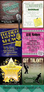
 As I finished up the poster for this year's Talent Show at my Middle School, I sat back and thought, "Damn. These people are lucky to have me."
Maybe a little arrogant, but seriously. I love the one I did this year! So I thought I would post it here, with a few tips on how I did it, along with some of the ones I've done in the past. I've been in charge of the talent show at my school for over ten years, so its fun to look at each of them and see how much I have improved in Photoshop!
2016-2017
The challenge of this one was making the text neon. I tried SO MANY THINGS. And finally, I found the simplest solution of all--an AMAZING and FREE action that you can find here:
Here are a few tips and tricks on how I created this:
- The brick and the wood floor are separate pictures. I added a gradient to make them black in the center. I also used the transform tool "perspective" to make the floor look like it was heading forward. Finally, I used desaturate on the brick and made it darker than the original image.
- I used Filter>Render>Lighting Effects on the microphone to change the light source. It's not perfect but it works.
- For the circle, I drew a shape circle that I wanted, then CTRL+Clicked on the that circle (after I rasterized it) and added a new layer. Then I did Edit>Stroke and added a thick stroke. Then I deleted the circle. I then just used the erase tool to cut out the parts of the circle I didn't want, and then used the Neon Action on it.
- I used the fonts Warnes and Automotive to do the title
- To give the brick a more lighted look, I created a white shape then used Filter>Render>Difference Clouds. Then I changed the style from normal to color dodge. Then I used a thick feathered eraser to get rid of the edges so it was only in a circle behind the sign. Finally, I changed the opacity to make it transparent.
2015-2016
Tips & Tricks
- The paper in this is an actual piece of paper that I took a picture of. The brown desk behind it is actually the desk in my classroom! I did add the lines to the paper, however, and made them a pale green with high opacity so they weren't too obvious.
- I used my good old Atomic Cupcake actions on these--I'm so sad you can't buy them anymore! The one on "talent" is Rough Lighograph, on of my favs.
- The pictures in the background are actually photographs from previous talent shows--I just used a filter on them to make them look like that. First I chose the color green in my foreground palette that I wanted, and the background color was white. Then go to Filter>Filter Gallery, and under artistic, choose Photocopy. Then play with the toggles until you get the look you want.
2014-2015
Tips & Tricks
- I created the title with the border and the microphone (from this free photoshop brush kit) and merged it. Then I used an Atomic Cupcake action, Stencil, to make it look...well, stenciled.
- The background is actually a bunch of brushes. I made a solid blue background and added a pattern to give it that grainy look. I found some free Photoshop brushes online (can't find them now!) I used a lighter color and lightened the opacity, and just sort of threw it wherever looks good.
2013-2014
To be honest, it's been a few years. So I'm not TOTALLY certain how I did some of this--namely the Elk Ridge title. I know I followed an online tutorial on how to do it but it's gone now!
Tips & Tricks
- I used a similar trick in this one as I did above with filters.
- I used an Atomic Cupcake action called Gel for the title and the box at the bottom
2012-2013
I feel like there was a giant leap from the previous year to this one. This was the year I really started to go all out on these posters!
Tips & Tricks
- I still love this one. All the delios in the background are free brushes I downloaded from Adobe and just sort of went crazy with.
- For the star, I had to use a tutorial I found online to get the shading right.
- I used an Atomic Cupcake action, "Simple Gloss" to do the title and small star.
2011-2013
Bleh. I hate this one. At the time I thought it was awesome. But now I am NOT a fan. The images are of actual students, so that's cool, but--meh. It does show how much better I have gotten at design work since then! Keep in mind--I am NOT a designer and have no formal training. I am somewhat of an artist (I can basically draw Disney characters and that's pretty much it) but Photoshop is my new art form. I love it! ONE of these days, I might just bother to learn Illustrator, and then I'll be hitting myself for not using it all these years and saving myself a lot of time...one day...


No comments:
Post a Comment